
Schwarzwalder
How do you capture the atmosphere of the Black Forest in a single symbol?
Schwarzwalder was a café inspired by the Black Forest and its calm, mysterious atmosphere. For Schwarzwalder, we designed a logo with an owl as its symbol.
The Challenge
The café was built on quality coffee and a welcoming place people liked to come back to. Its logo had to express this feeling at first glance and refer to the Black Forest, where the name comes from.
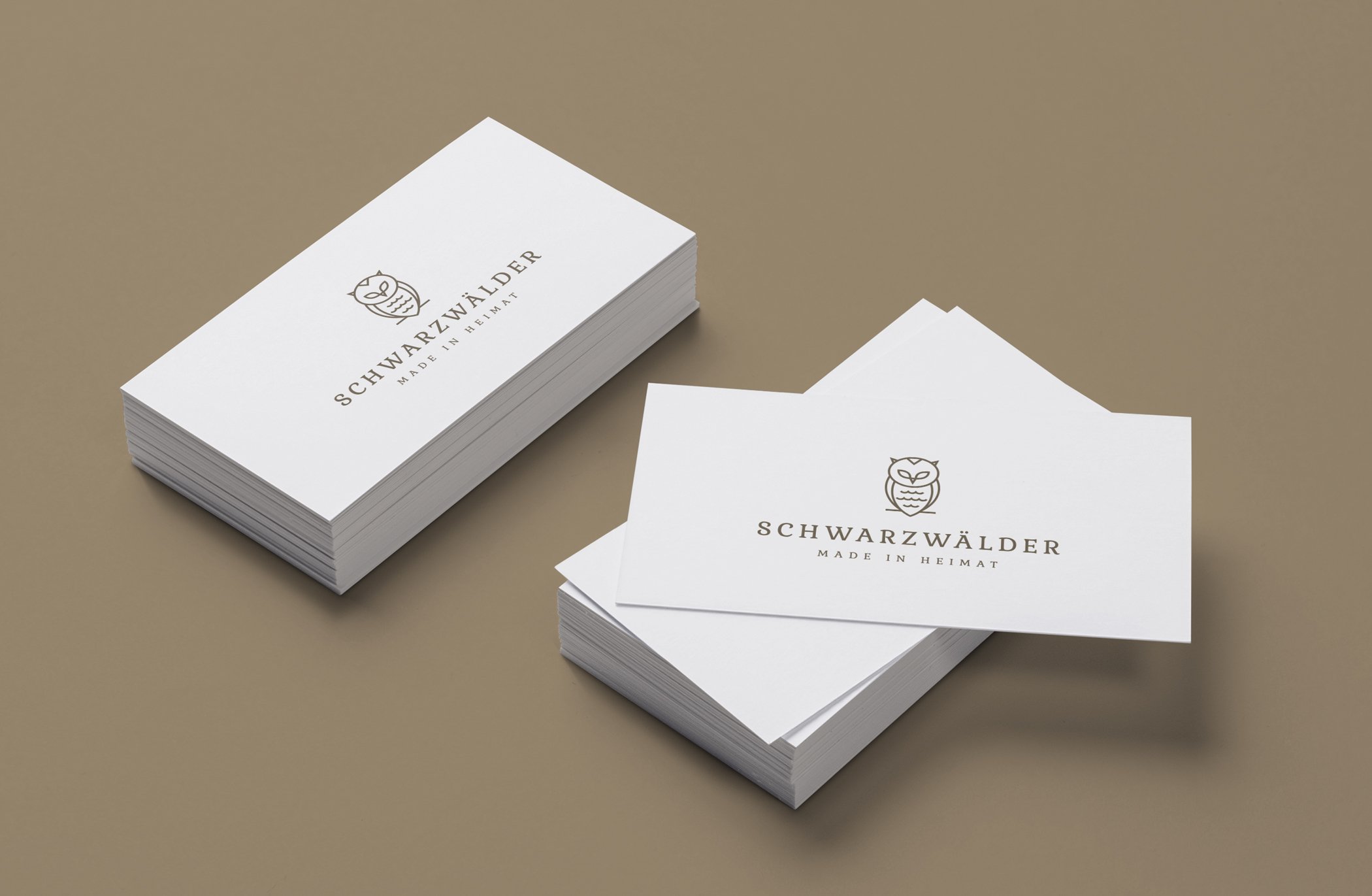
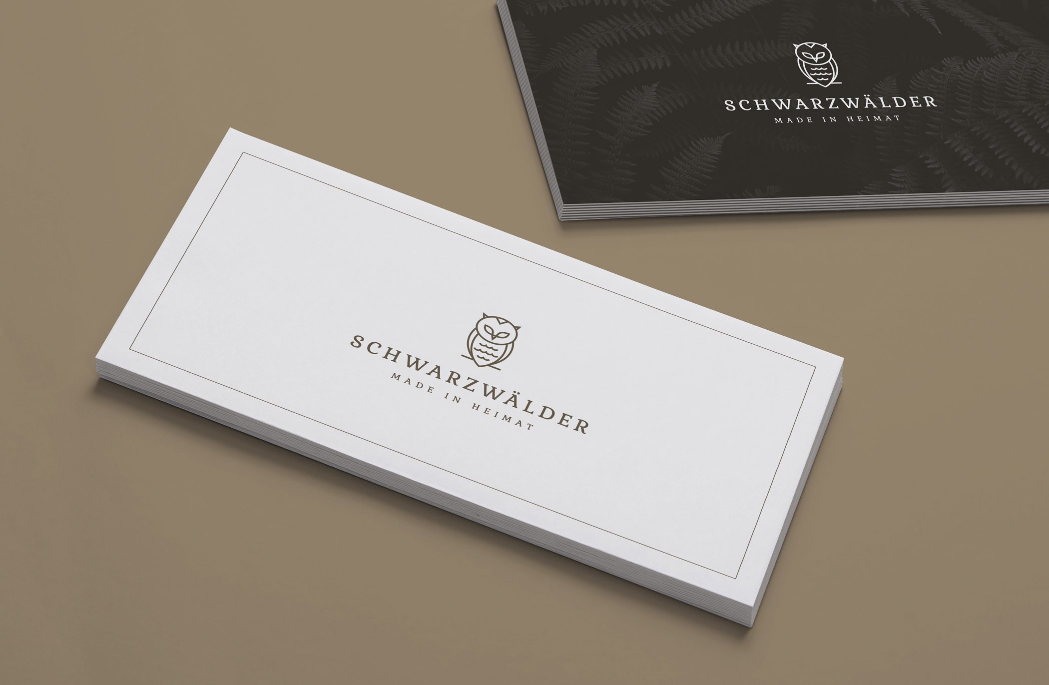
At the same time, the mark had to be simple and memorable, so it would work on cups, packaging, menus and social media.
The Solution
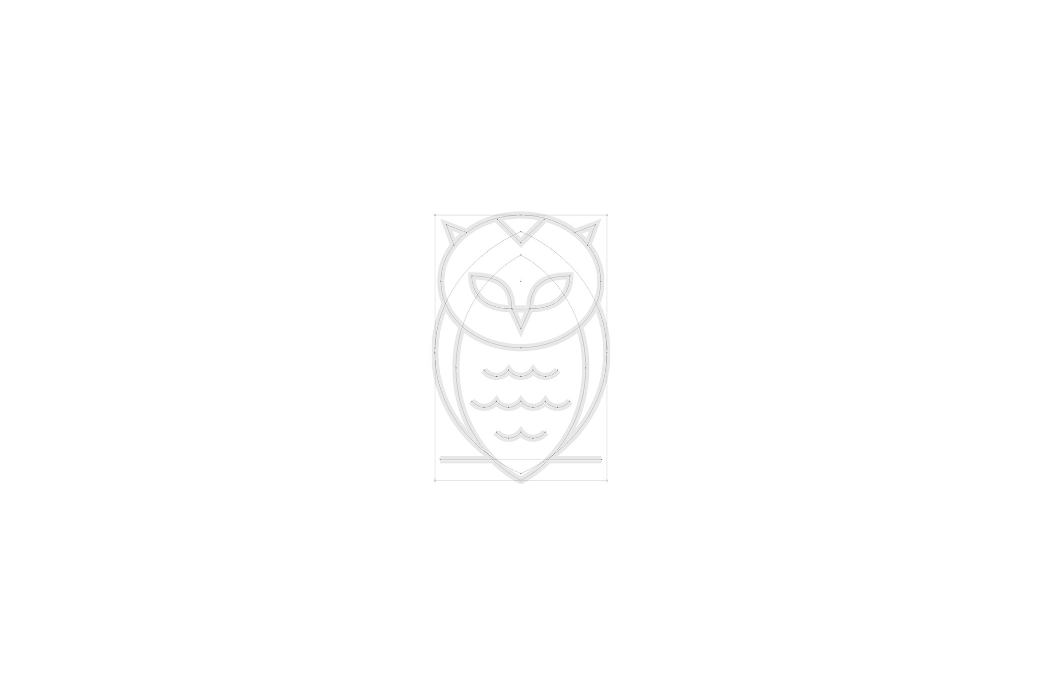
We built the logo around an owl, a typical forest dweller. This bird naturally refers to the Black Forest and gives the brand a calm and friendly character.
Our goal was a clean, easy-to-read symbol that works in large and small sizes. Together with the wordmark, it forms an elegant and timeless logo.
The Result
The café used the logo across its communication. For its guests, the owl became the sign they connected with Schwarzwalder: the forest, calm and good coffee.