
Oradent

What should the logo of a dental clinic look like when both kids and parents look forward to a visit?
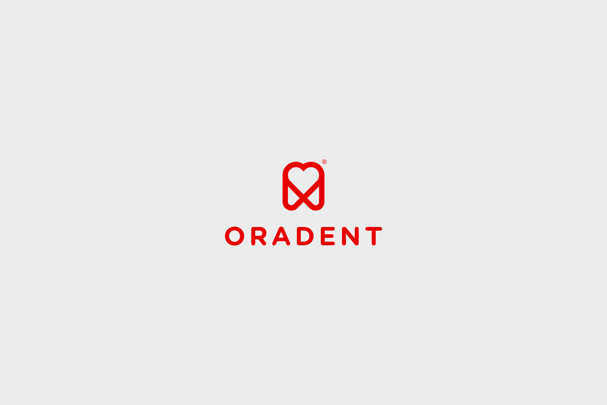
Oradent is a modern family dental clinic in Bratislava that cares for children and adults alike. For Oradent, we designed a new logo. Its symbol combines two motifs: a tooth and a heart.
The Challenge
For many people, a visit to the dentist still means stress. This is especially true for children. The clinic wanted its brand to say the opposite: that patients will find safety, expertise and a human approach here.
At the same time, the clinic builds on state-of-the-art equipment and microscope dentistry. Therefore, the logo could not feel childish or too playful. It had to appeal to parents looking for professional care. However, it also had to feel friendly to the youngest patients.
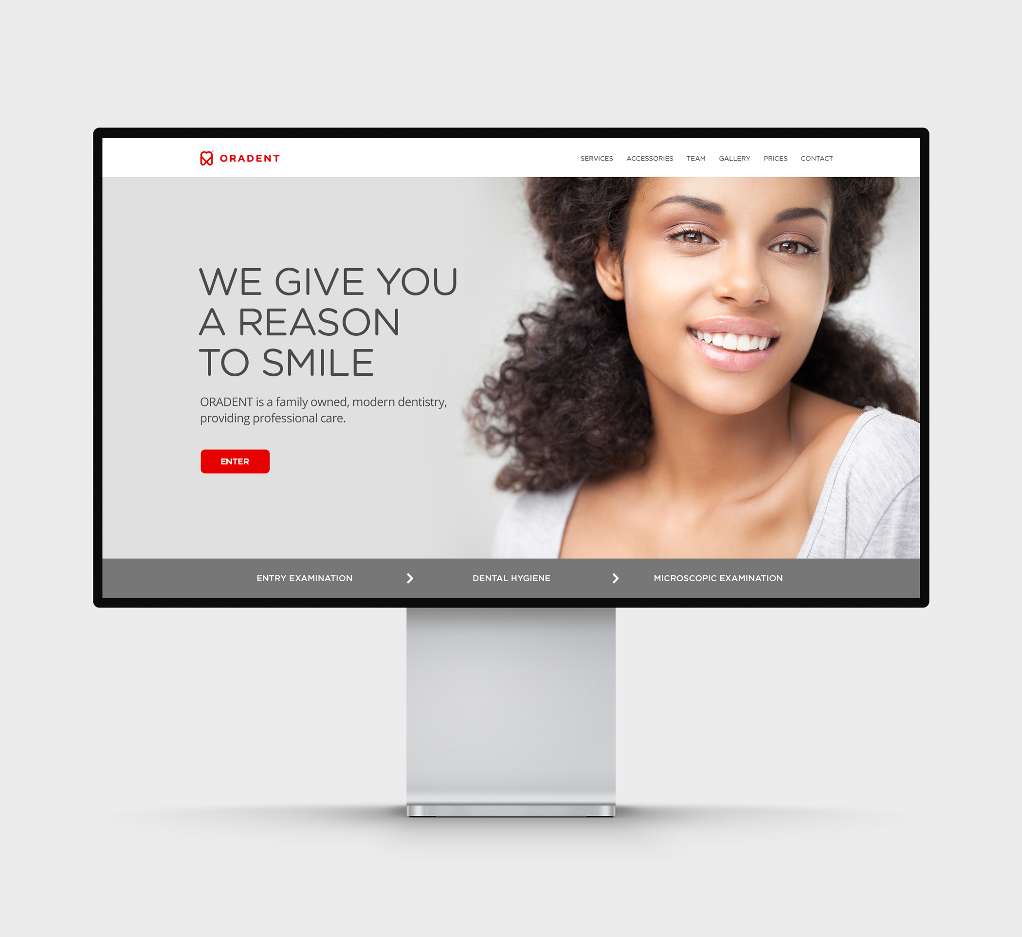
In addition, it had to work everywhere the clinic communicates: on the building, on the website, on social media and as a small icon on a phone screen.
The Solution
At the core of the logo is the combination of a tooth and a heart in one symbol. The tooth says what the clinic does. Meanwhile, the heart adds how it does it: with care, patience and genuine interest in every patient.
We kept the symbol simple and clean, so people recognise it at first glance. As a result, it works at both large and small sizes and stays legible even on tiny surfaces. Next to the symbol, we added a wordmark that feels calm and trustworthy.
Above all, the whole logo is about balance. Its clean shape stands for expertise and modern technology, while the heart motif brings warmth and a family atmosphere. That way, it speaks to adults and children at once.
The Oradent Result
A logo used today by a family dental clinic in Bratislava. A single symbol brings together what patients expect from a good dentist: expert care and a human approach.
Because with dentists, it is not only about how well they treat you. It is also about how you feel there. And that starts with the logo.