
Bosp

Can a logo be modern and still respect where it came from? With the BOSP project, we set out to answer that.
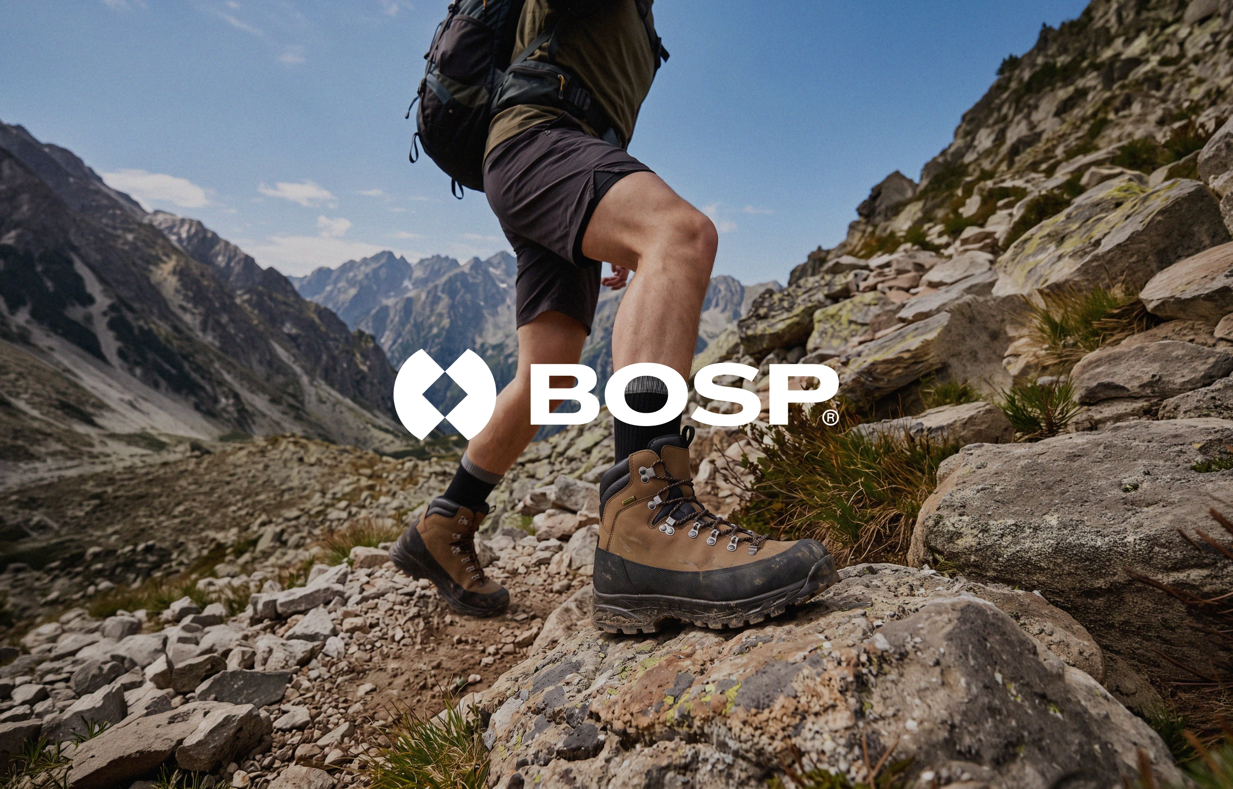
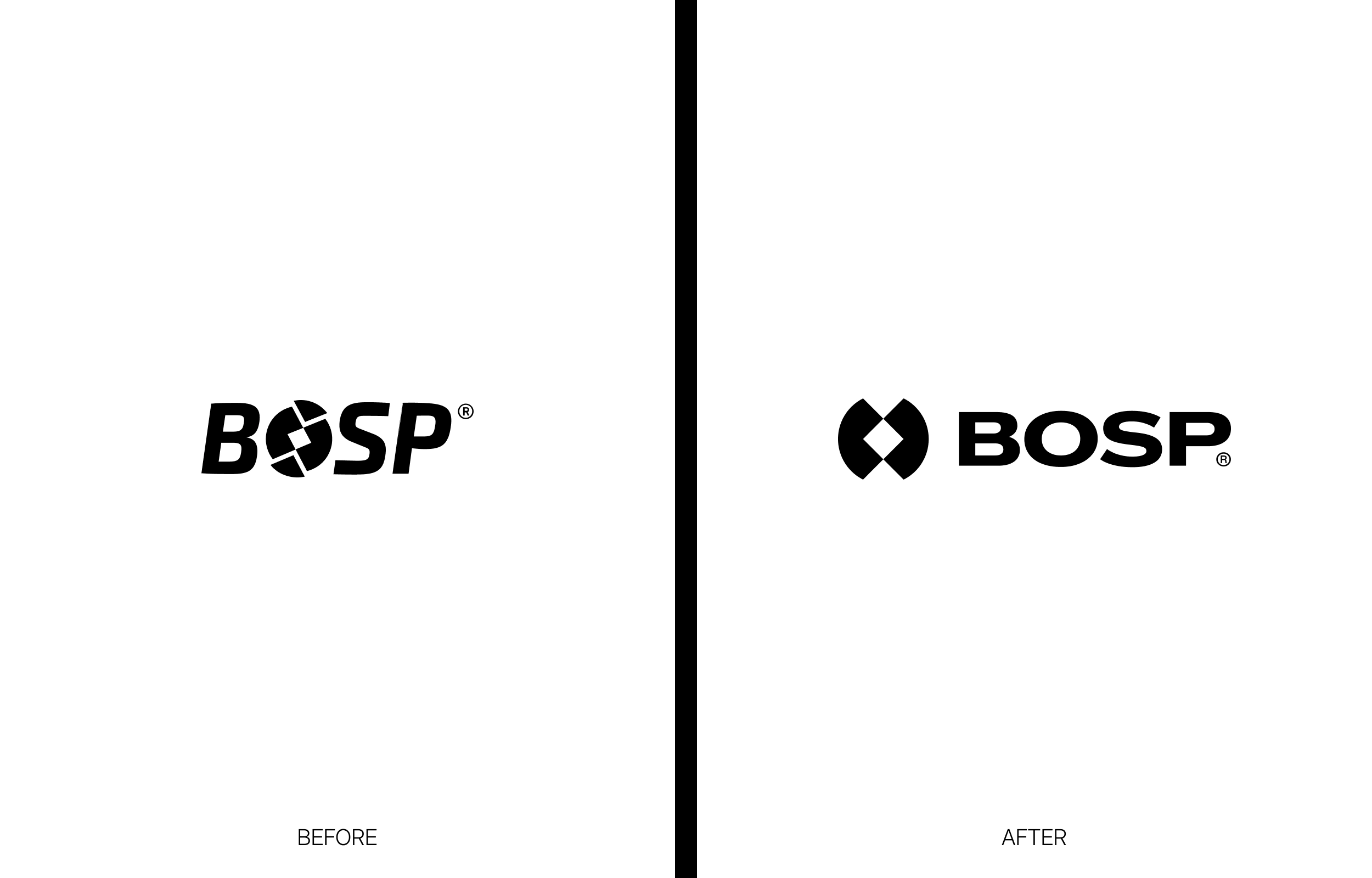
For BOSP.sk, the largest footwear manufacturer in Slovakia, we redesigned the logo and built a visual identity to match. This BOSP logo branding project began with a clear brief: create a modern logo that still respects the original. The brand already has a recognisable look. So our job was not to replace it, but to bring it forward.
The Challenge
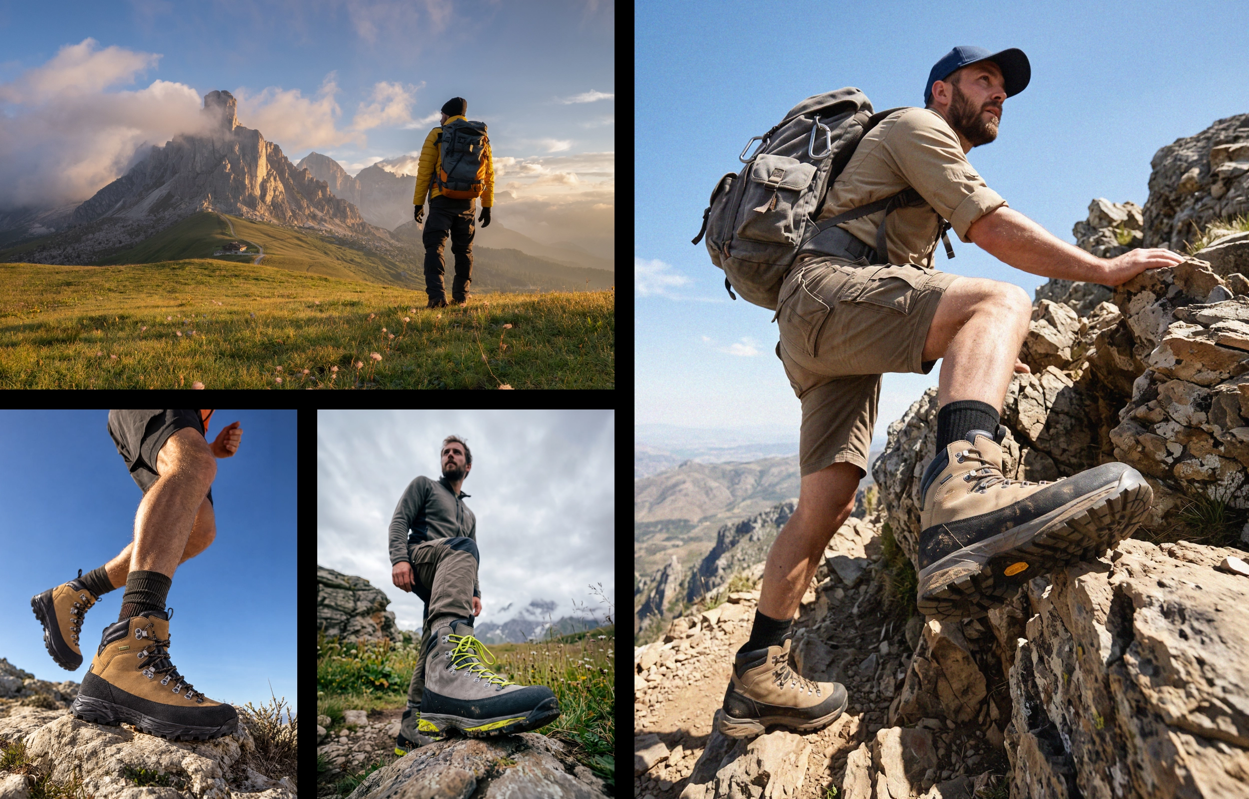
BOSP makes boots for real-life workdays, mountain trails and everything in between. Therefore, its identity had to feel just as solid: durable, honest and easy to trust. However, the original logotype’s slanted lettering limited readability at small sizes and on screens. Still, it carried the brand’s heritage, and that was worth keeping.
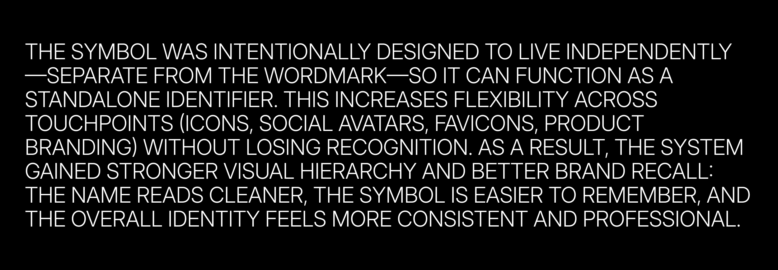
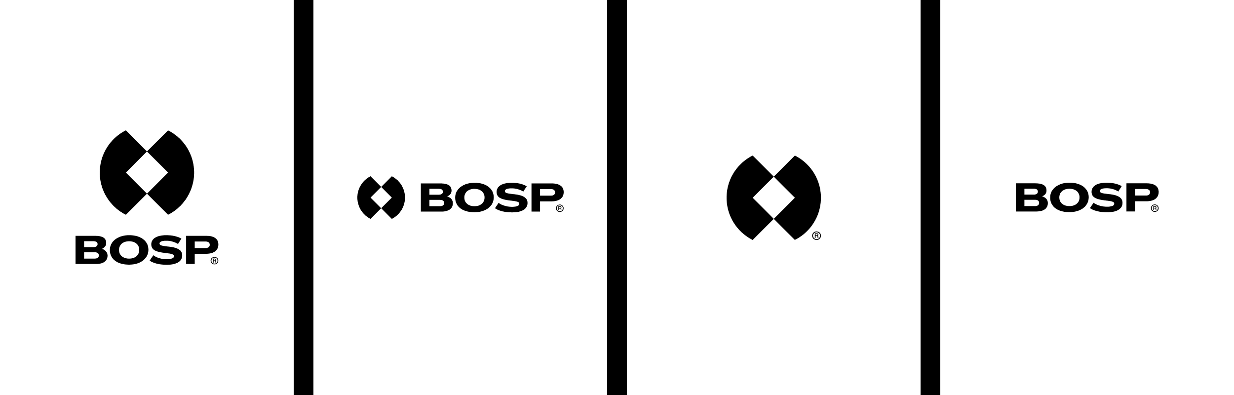
As a result, the update had to improve clarity across digital and print. At the same time, the brand needed a symbol that could live independently of the wordmark. It had to work as an icon, social avatar, favicon or product mark.
The Solution
First, we kept the core idea of the original: the circle with a diagonal cut. It used to sit inside the letter O. Then we took it out of the wordmark and rebuilt it as a standalone geometric symbol. Two mirrored shapes now form a diamond in the centre, so the mark is simple and easy to remember.
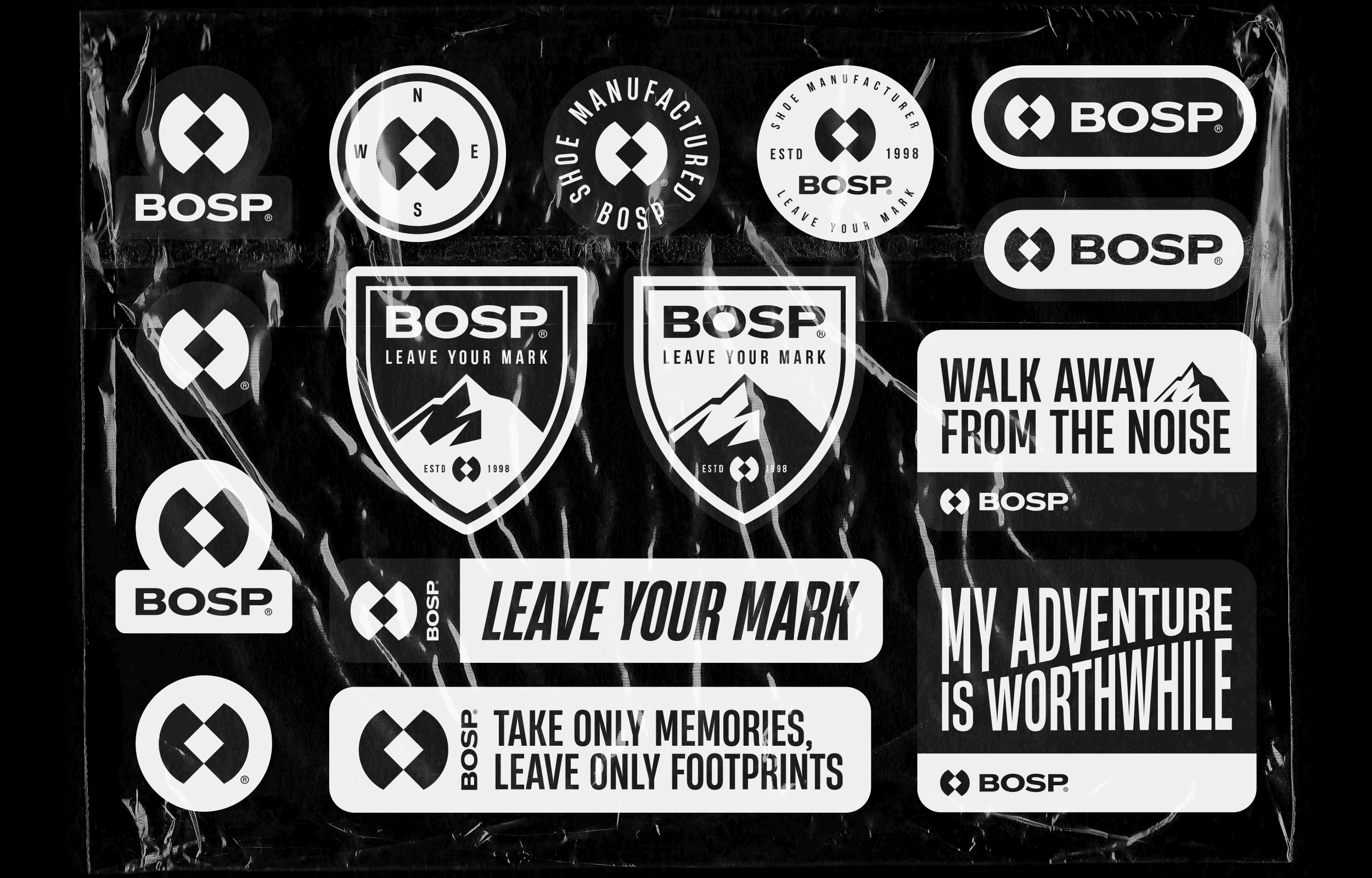
The wordmark follows the same logic. Instead of slanted letters, we chose a wide, stable typeface. As a result, the name reads clearly at any size and feels calm and confident. Finally, we created a flexible set of lockups: symbol, wordmark and combined versions. Because of that, the identity stays consistent across every touchpoint.
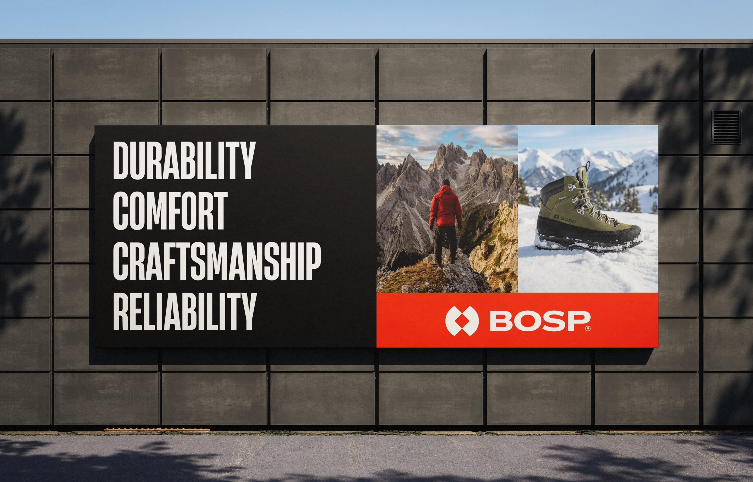
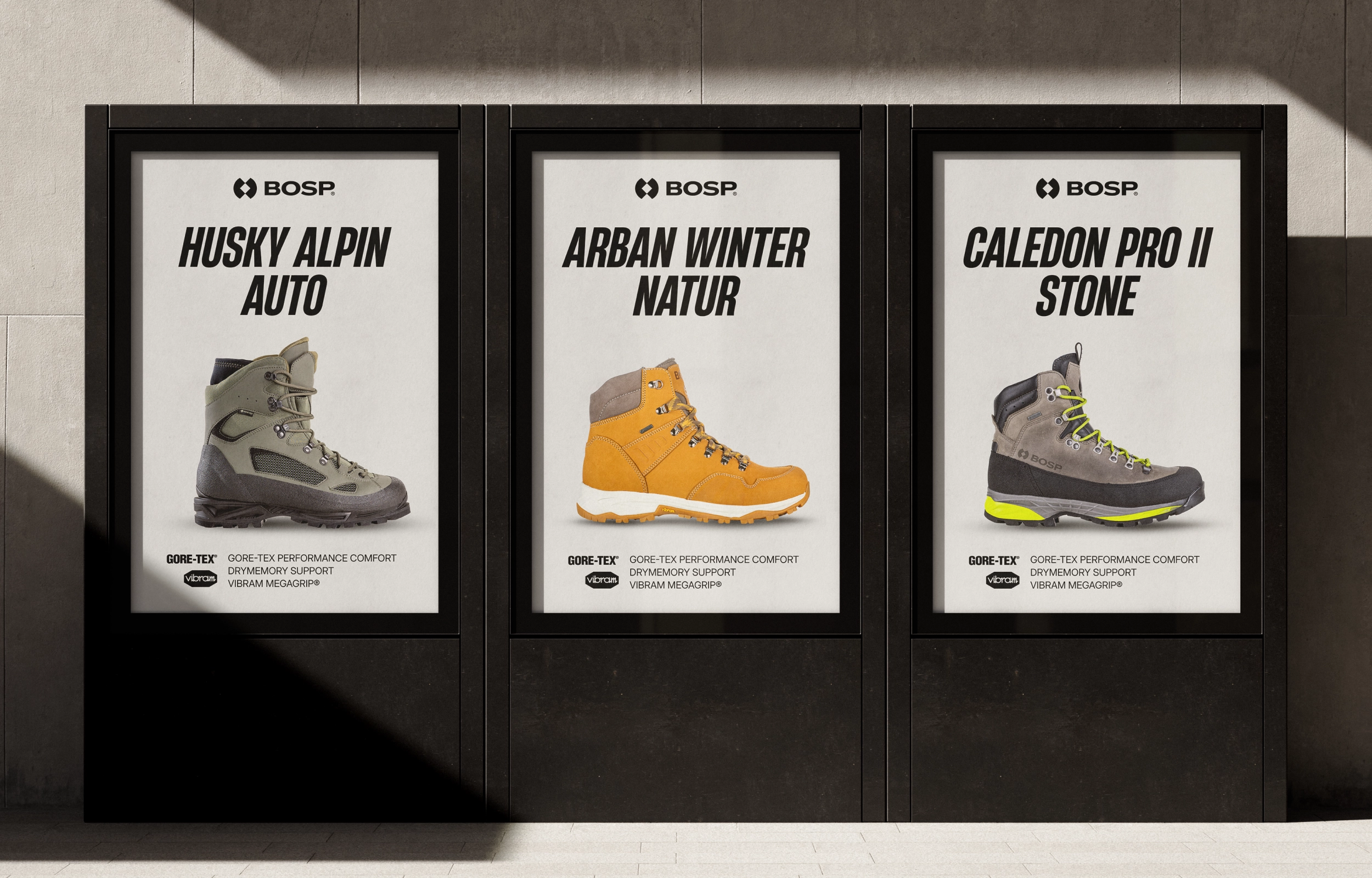
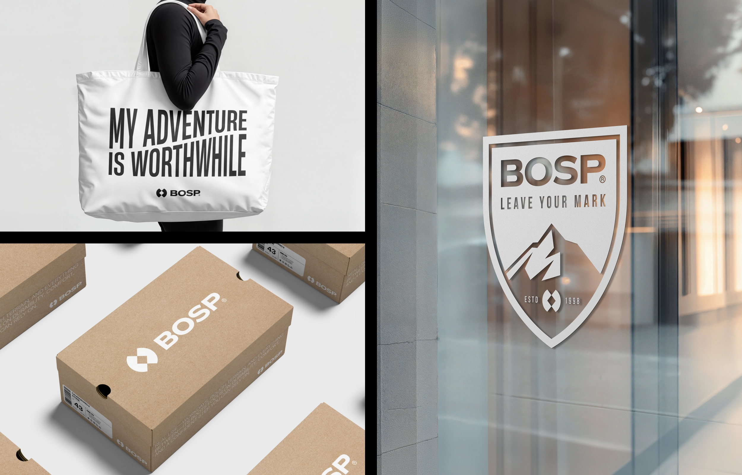
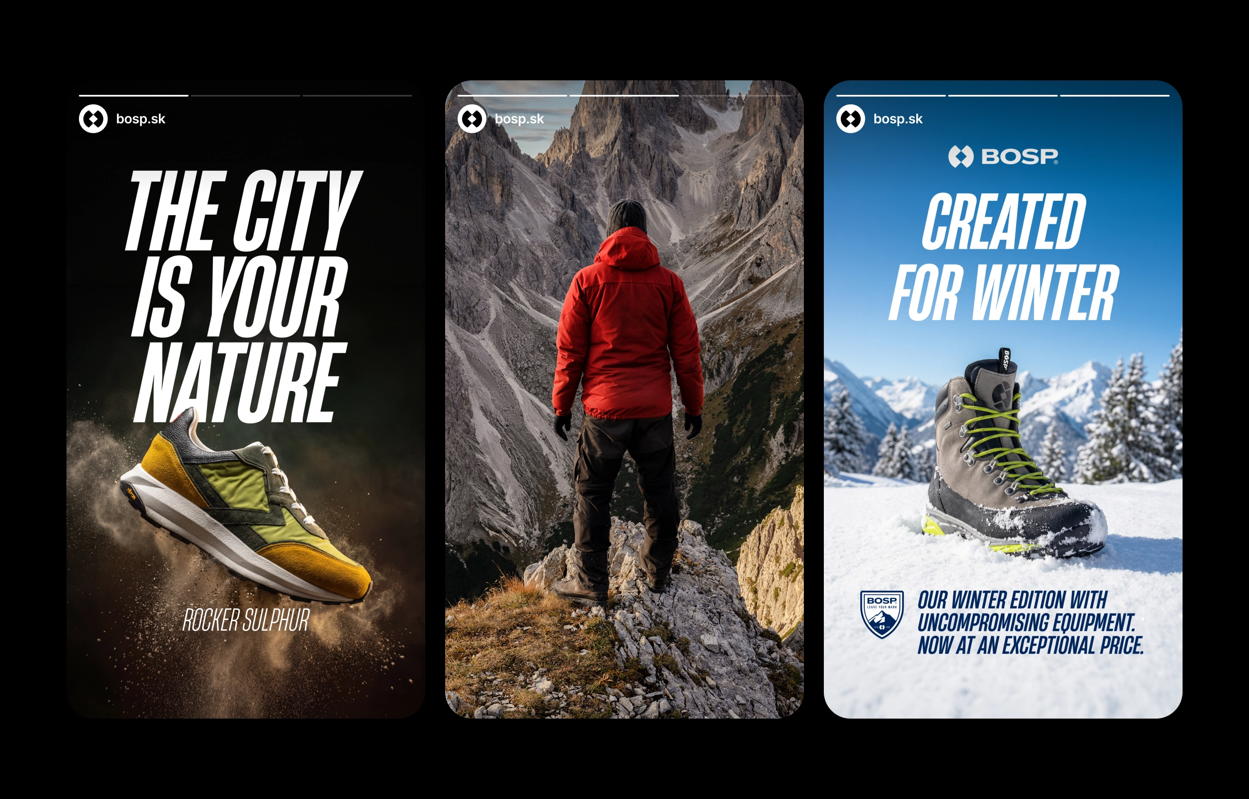
We then applied the new identity to outdoor advertising, product posters, packaging, storefront graphics, stickers and social media campaigns.
The Result
The new BOSP logo branding has a stronger visual hierarchy and better brand recall. Moreover, the name reads cleaner, and the symbol works anywhere. Overall, the system feels consistent and professional. At the same time, the original DNA is still there, so the brand feels familiar, only sharper.
In other words, it carries the brand’s core values: durability, comfort, craftsmanship and reliability. You can see them on billboards, posters, shoeboxes, shopping bags and campaign graphics.
Because in footwear, trust is built step by step. And good branding knows that, even when you can’t see it.
Check out more of our branding projects.