
Rasetop





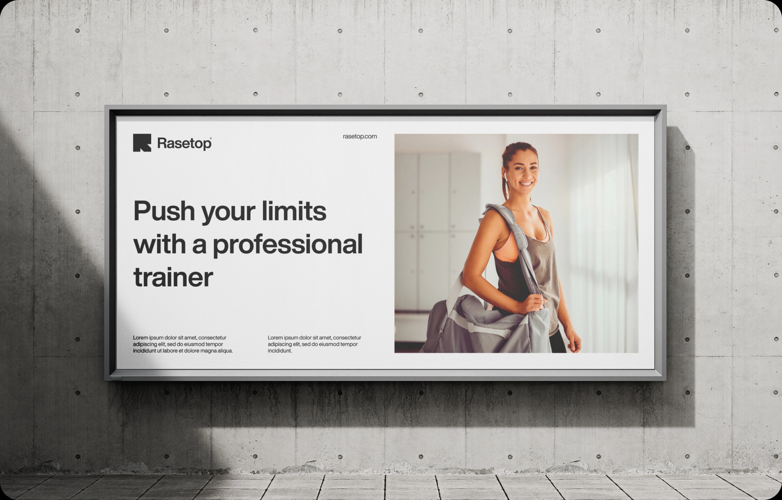
A visual identity for a fitness network that doesn’t exist — but could.
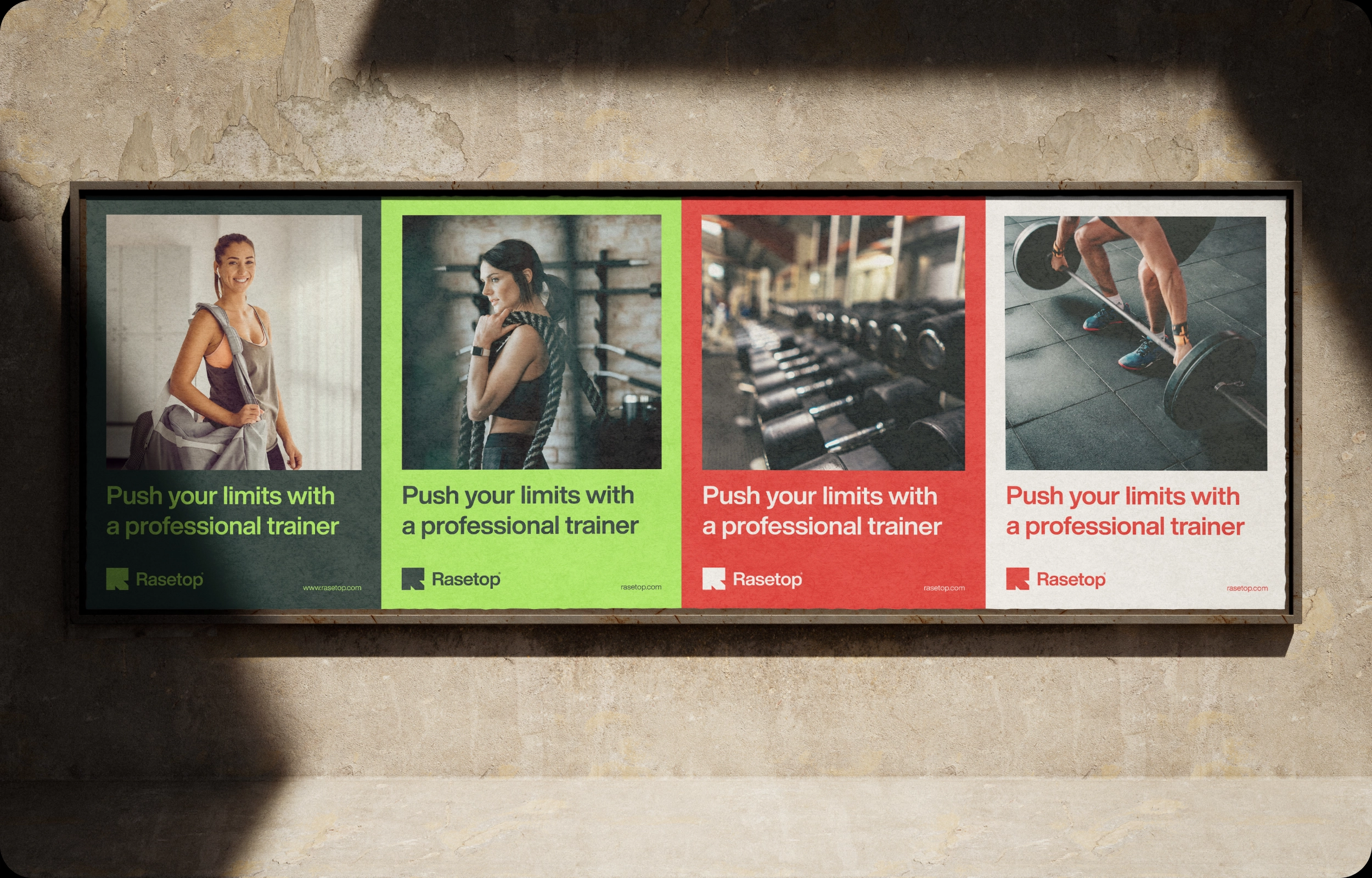
Some brands sell memberships. Rasetop sells a goal. This visual identity for a fitness network is built on one idea — everyone has their peak. In fitness, in training, in life. The role of design was to translate this idea into a visual language that speaks to everyone differently, but says the same thing.
The Challenge
Creating an identity for a fitness network that needs to be a system — scalable, consistent, and flexible enough for different types of clients and environments. Moreover, the brand had to work across various media — from digital platforms to physical gym signage.
The Solution
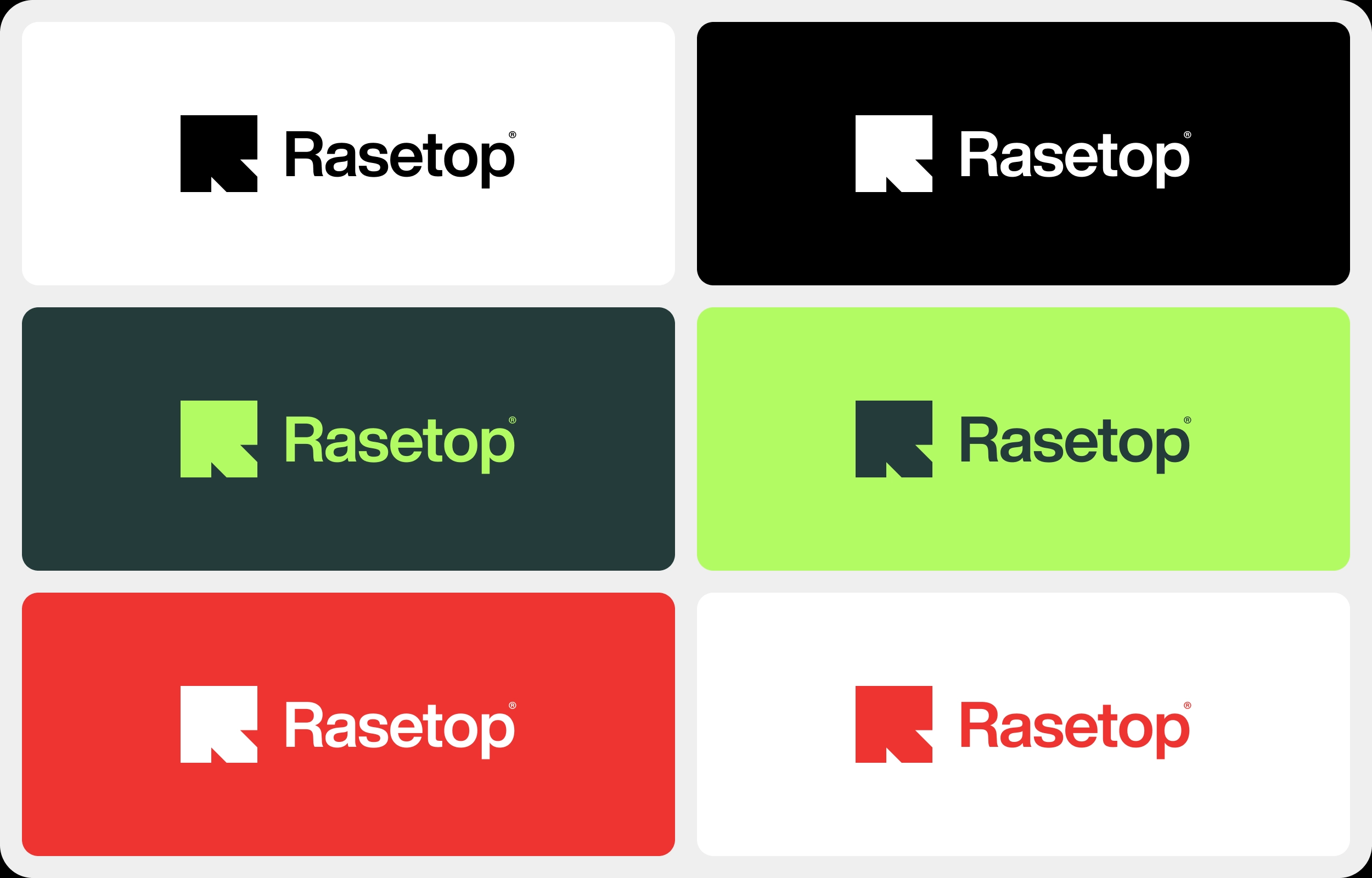
The name Rasetop is a made-up word — and that’s precisely its strength. It’s not tied to any language, culture, or style. It’s universal. The visual identity of the fitness network reflects this universality — the deliberate absence of a dominant color opens space for diversity. Every center, every person, every goal can have its own version of Rasetop.
The logo was born from a simple but precise idea: the letter R conceals an arrow pointing upward. It’s not accidental — it’s intentional. The symbol of growth, progress, and reaching the peak is built directly into the brand identity. The longer you look at the logo, the more you see it. And that’s exactly what good design does — it says more than it reveals at first glance.
The Result
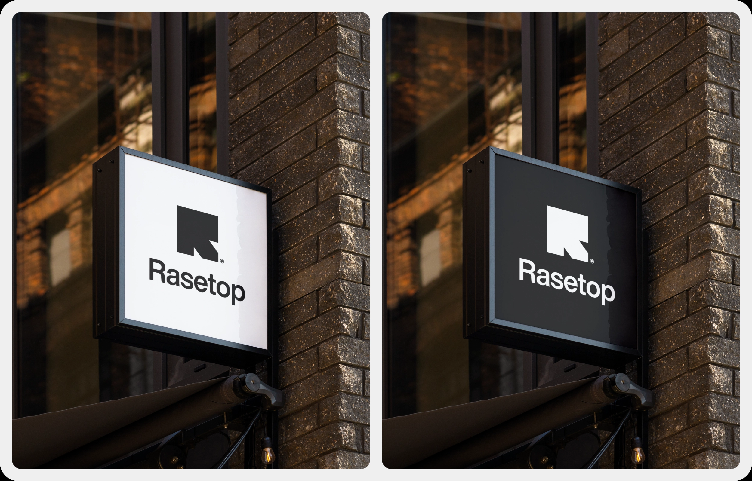
Branding designed as a platform, not a template. A system that grows with every new center while remaining instantly recognizable. Additionally, the identity works equally well on mobile, billboards, and building facades. Therefore, Rasetop was not just a project — it was proof that good design can build a brand before the first brick is laid.
Rasetop. Reach your peak.