
VOSK





How should a brand look when companies trust it with their purchasing and public procurement? With the VOSK project, we set out to answer that.
VOSK, a.s. was a Bratislava company focused on public procurement, corporate purchasing and electronic auctions. For VOSK, we redesigned the logo, built a visual identity and designed the website. Our goal was clear: the brand had to feel modern, precise and trustworthy.
The Challenge
Public procurement and electronic auctions are a world of rules, deadlines and numbers. Clients look for a partner who is reliable and in control. They also want someone who can save them time and money. Therefore, the brand had to feel serious, yet contemporary, simple and easy to understand.
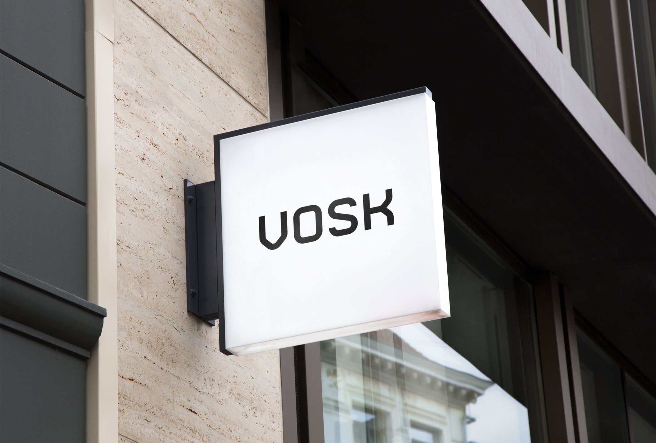
It also had to work in print, on the building and in the digital space, where clients worked with it most often. A good logo had to read clearly on a large facade sign. At the same time, it had to work as a small icon on a phone screen.
The Solution
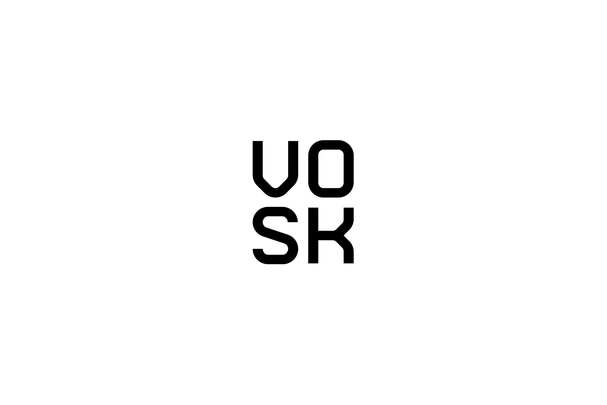
First, we redrew the logo as a clean, minimalist wordmark with solid, geometric shapes. We created two versions. One is horizontal, for everyday use. The other is a compact VO/SK square that works as an app icon, profile picture and badge.
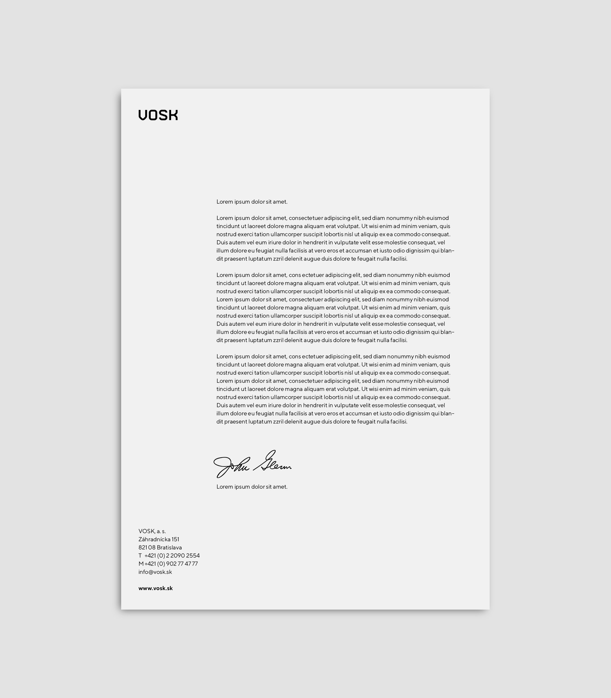
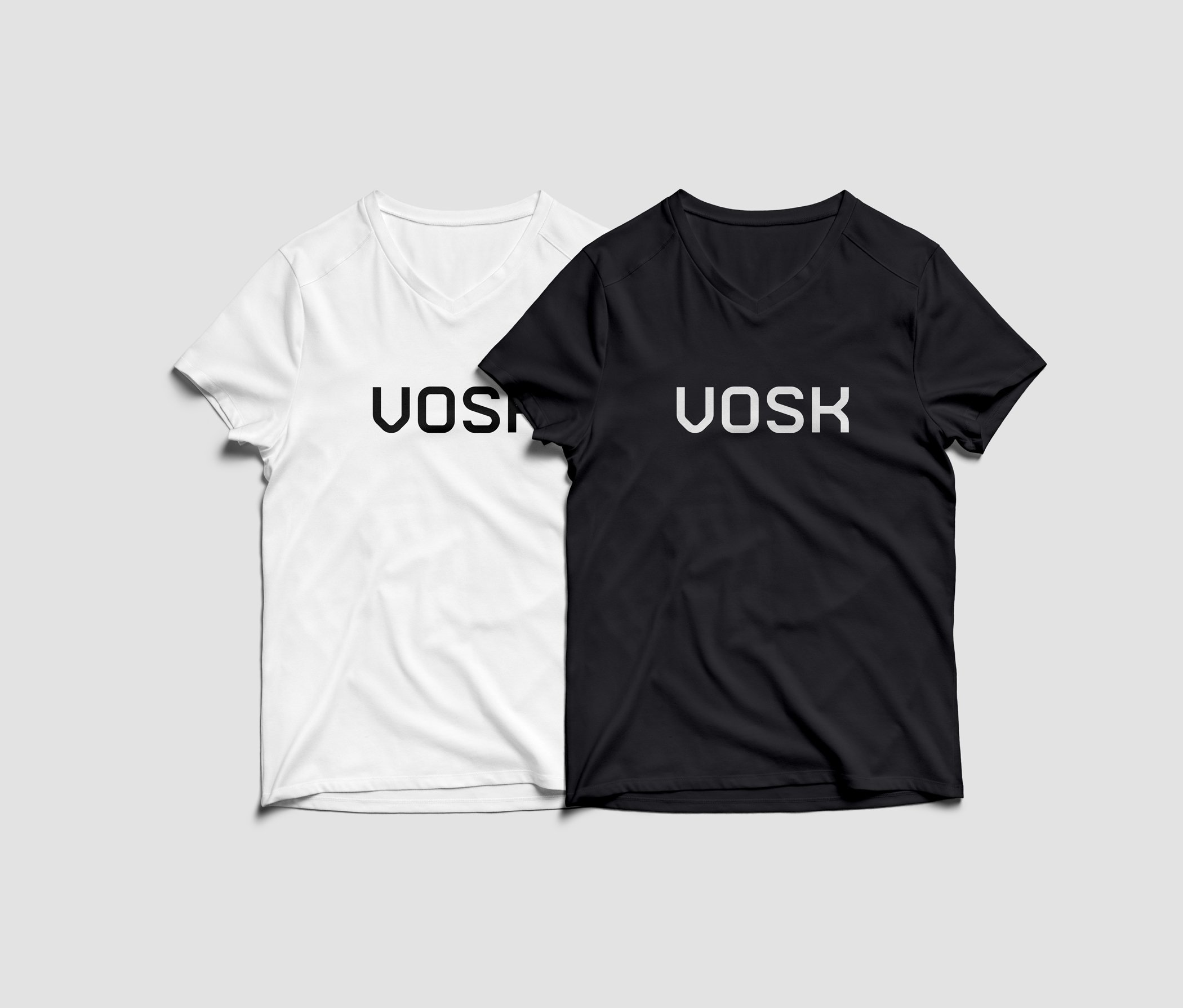
Then we extended the identity to business cards, letterhead, building signage and T-shirts. Everything speaks the same simple language: black, white and a bold blue, plenty of white space and clear typography.
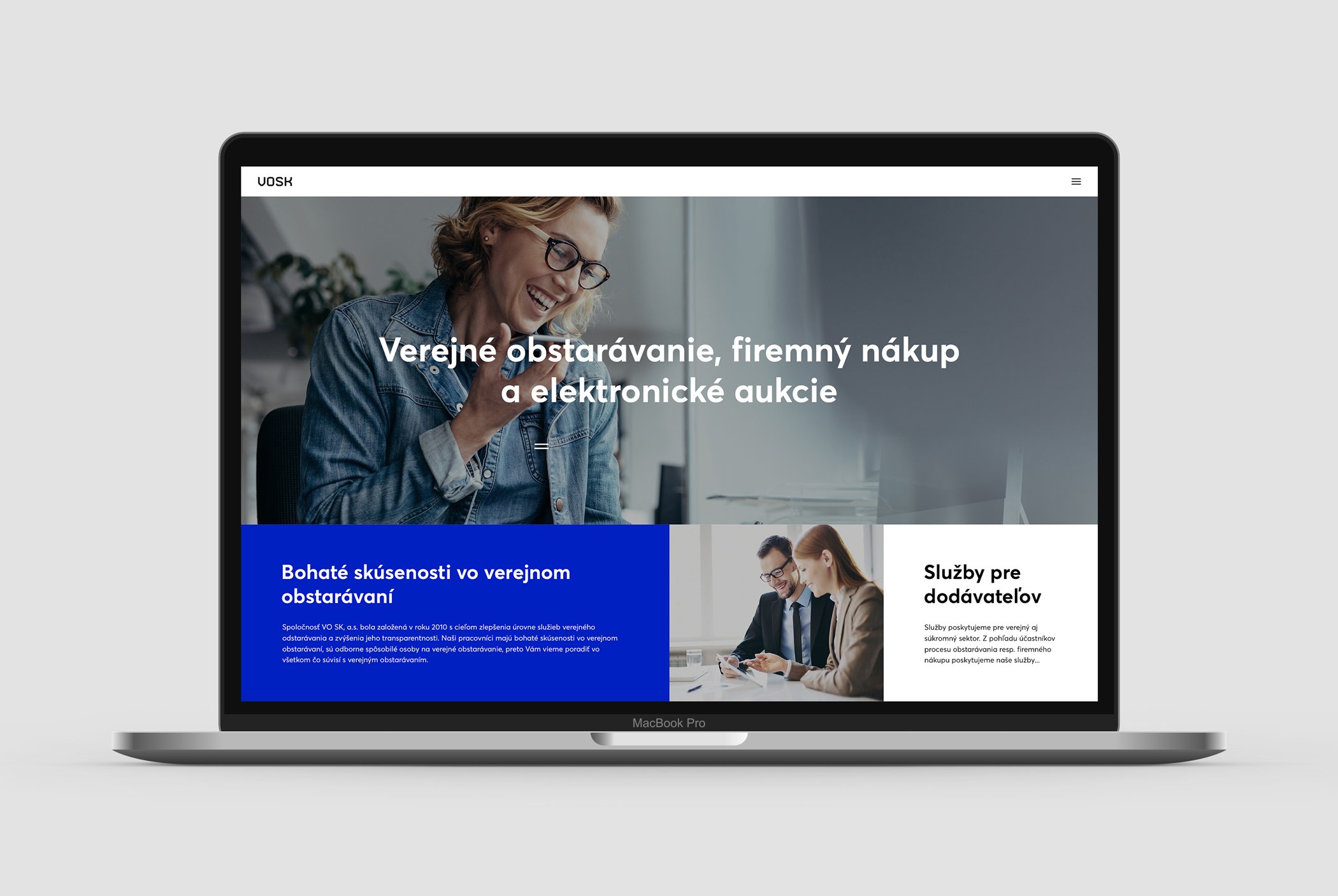
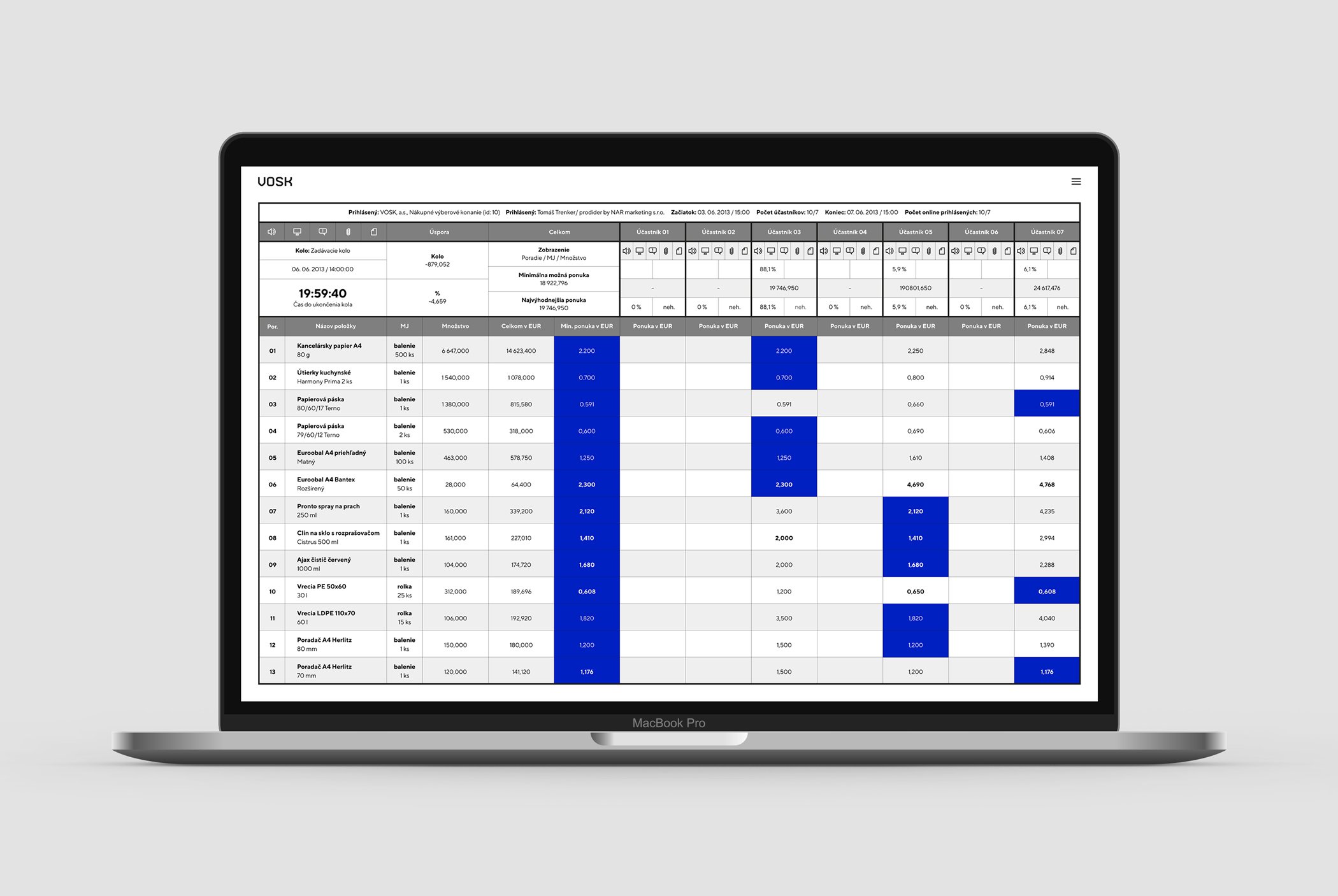
Finally, we designed the website. It presented the company’s services clearly. It also offered an environment for electronic auctions, with clear tables that worked on desktop and mobile.
The VOSK Result
Our client got a cohesive identity that felt modern, precise and trustworthy. Its logo, printed materials and website all spoke the same language. As a result, clients recognised the brand at every point where they met it.
Because in purchasing and procurement, trust decides. And trust is also built by how a brand looks.
Check out more of our branding projects or our services.