
Zugo Bike

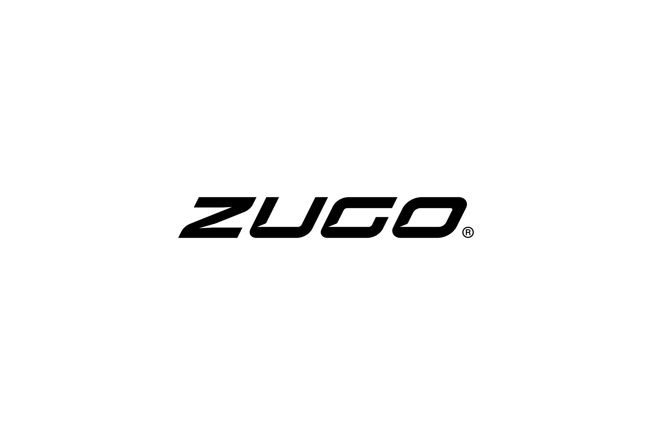
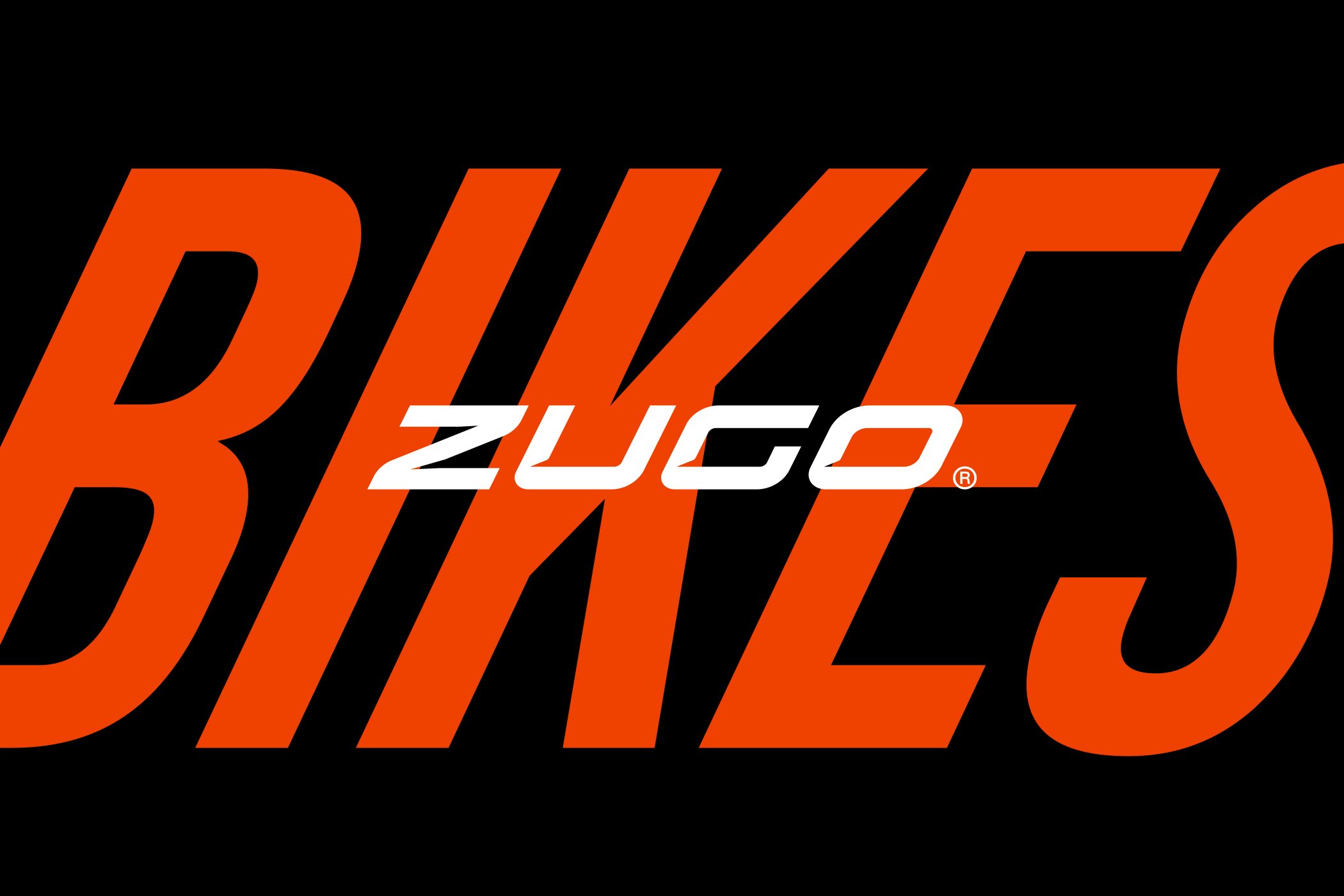
What could a logo look like for an e-bike built for adventure?
Zugo Bike is an American electric bike brand from Austin, Texas. It makes powerful fat tire e-bikes designed for fun and adventure. We created a new logo proposal for the brand. In the end, the client chose a different solution. Still, the proposal shows how we think about mobility brands.
The Challenge
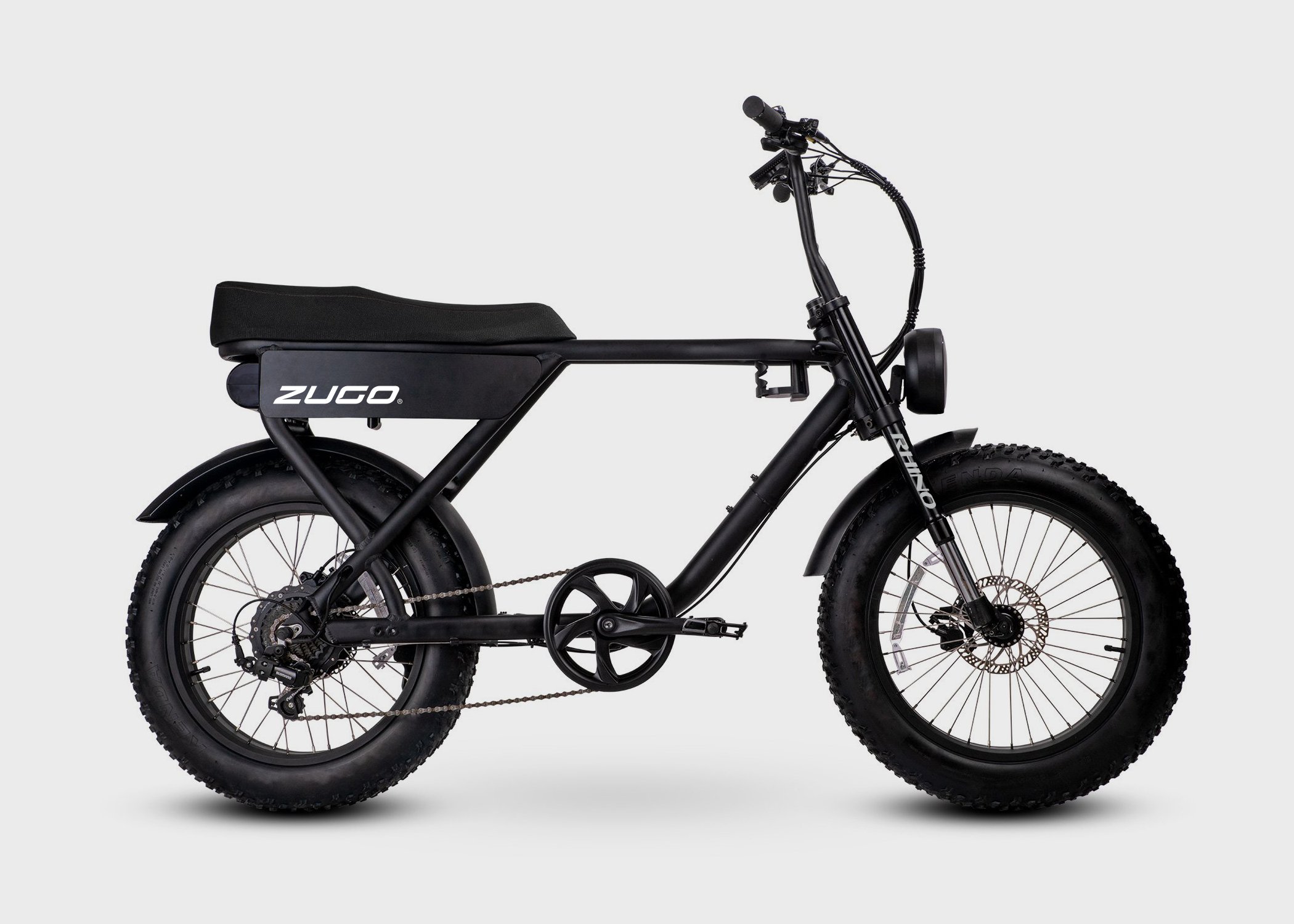
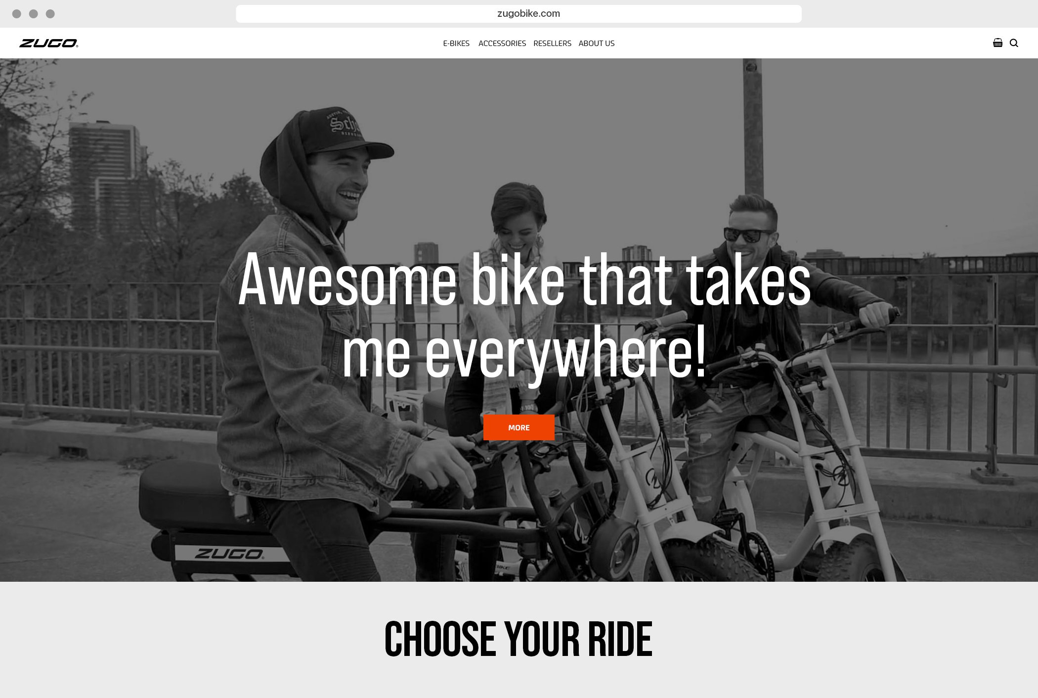
The e-bike market today is full of brands that look alike. Zugo Bike is built on power, style and the joy of riding. Therefore, the logo had to show these values at first glance. It had to work on the bike frame, the website, the online store and social media. Moreover, it had to work at both small and large sizes.
Customers often choose an e-bike online, without trying it first. Together with product photos, the logo carries a large part of the first impression. As a result, it has to inspire both trust and the urge to hit the road.
The Solution
We built the logo on dynamism. It reflects the energy and movement at the heart of the products. In addition, it captures the feeling of riding an e-bike itself. We made sure it was simple and legible. That way, it could be used directly on the product, where space is most limited.
We saw the short name Zugo as an advantage. Four letters give the logo strength. They also let it stand out even from a distance, for example on a bike in motion.
We also kept in mind that the brand speaks to people who want, above all, an experience from riding. So the logo was not meant to feel technical or cold. Instead, it is confident and playful at the same time.
The Zugo Bike Result
A logo proposal that combines power, style and movement into a simple, bold mark. Although the client went another way, Zugo Bike remains in our portfolio. It is an example of our work for an international mobility brand.
Because not every proposal ends up on the product. And it still says a lot about us.