Rasetop
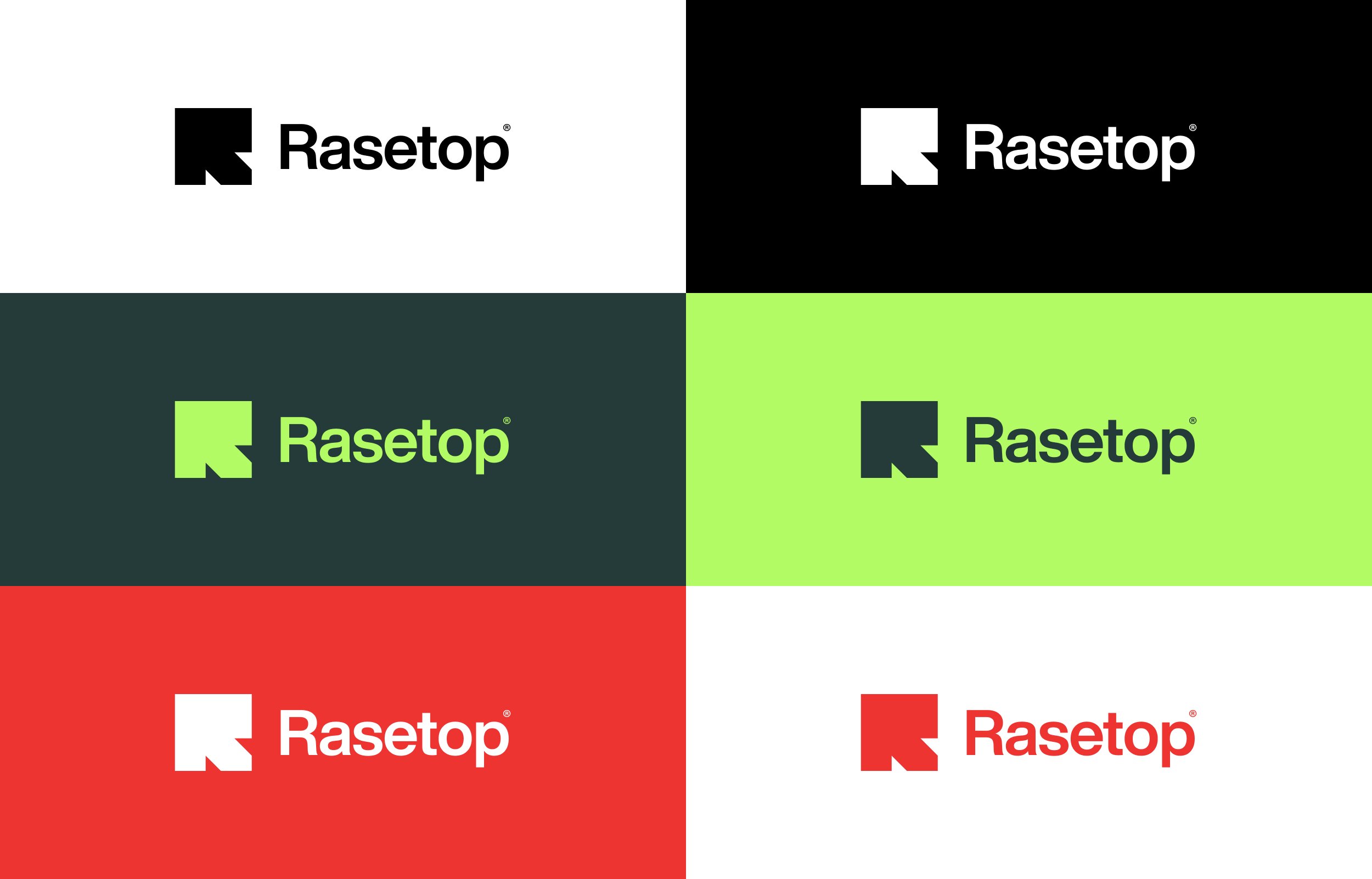
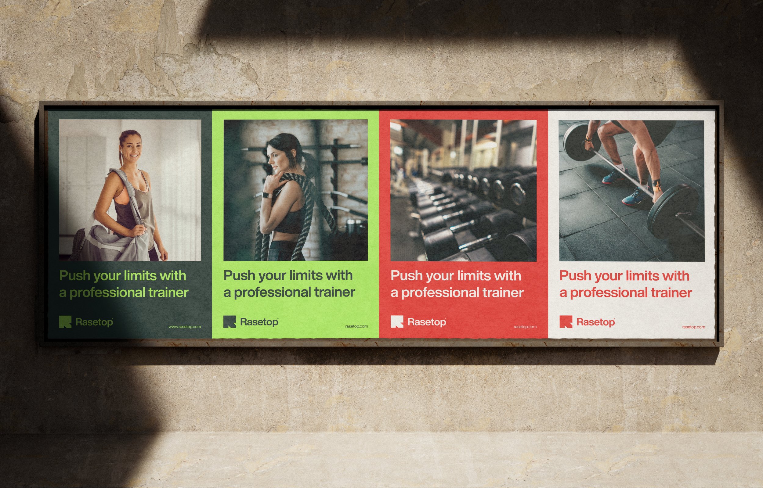
To complement the logo, we developed a cohesive visual identity that resonates with the target audience. The brand colors are a vibrant gradient of electric blue and energetic orange, symbolizing vitality and transformation. This color palette is paired with a neutral dark gray to add balance and professionalism.
The typography combines a bold sans-serif font for headings, emphasizing strength and confidence, with a clean, modern serif for body text, reflecting approachability and sophistication.
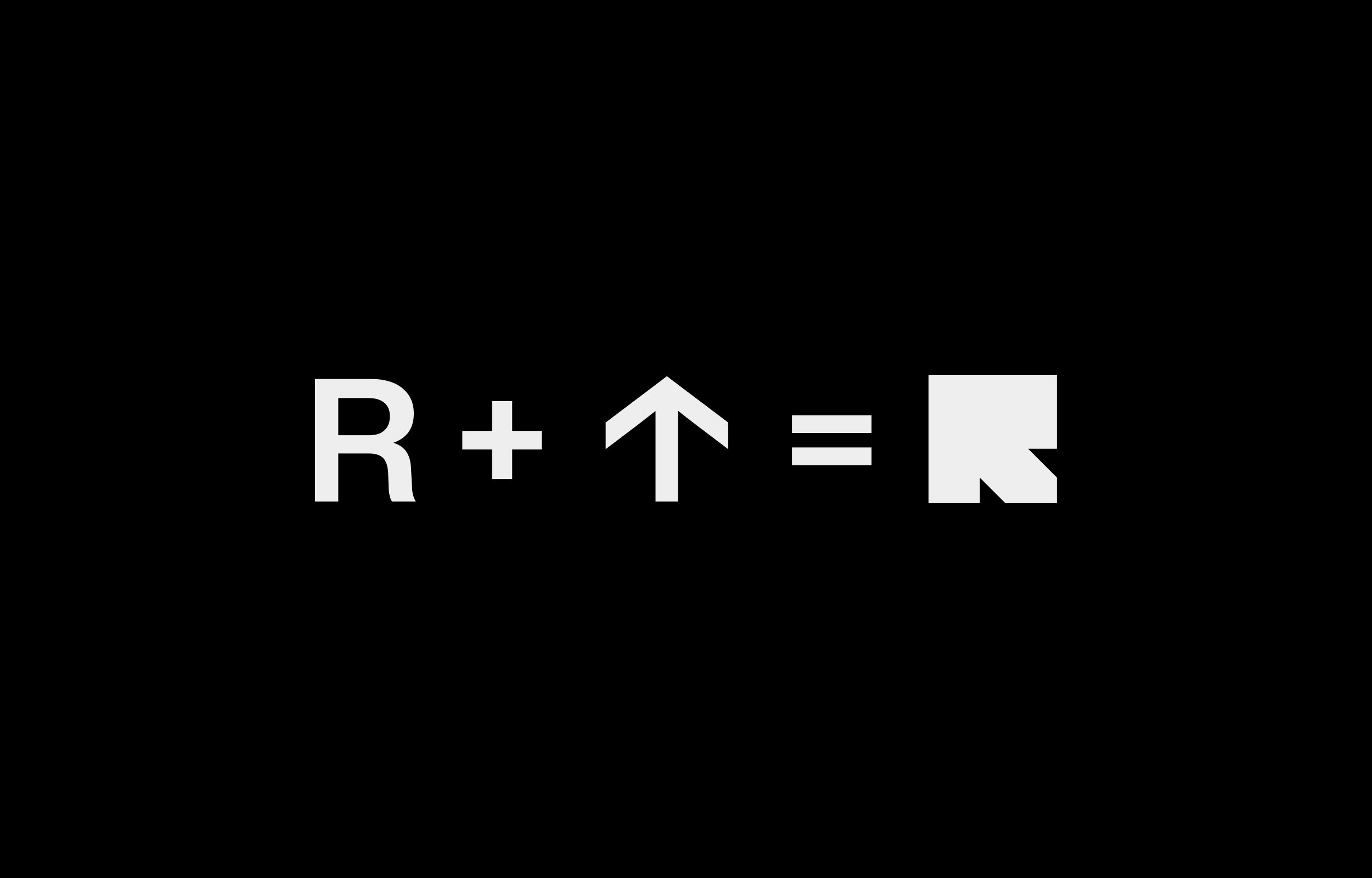
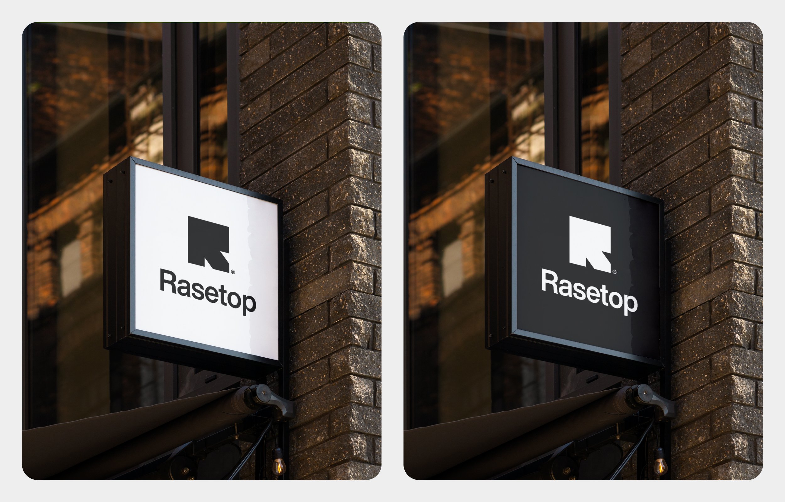
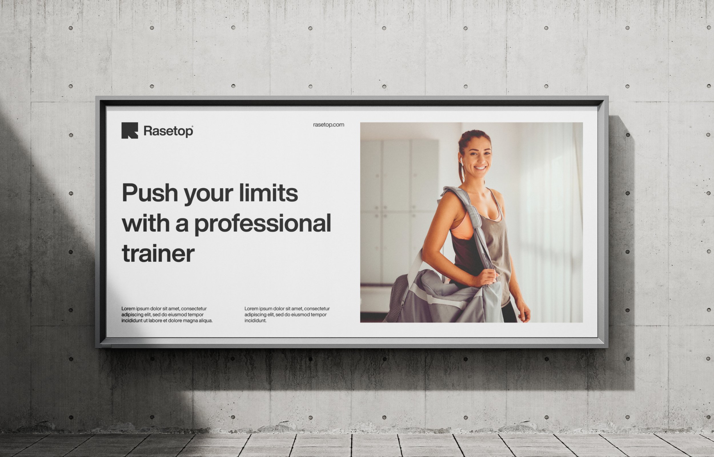
The visual elements include dynamic patterns inspired by movement and progress, such as diagonal lines and arrow motifs. These elements are used across various brand assets, including gym signage, promotional materials, and digital platforms.
Additionally, the imagery strategy focuses on authentic, high-energy photos of diverse individuals in action, reinforcing the center’s commitment to inclusivity and empowering fitness journeys for everyone.

