
Panakei


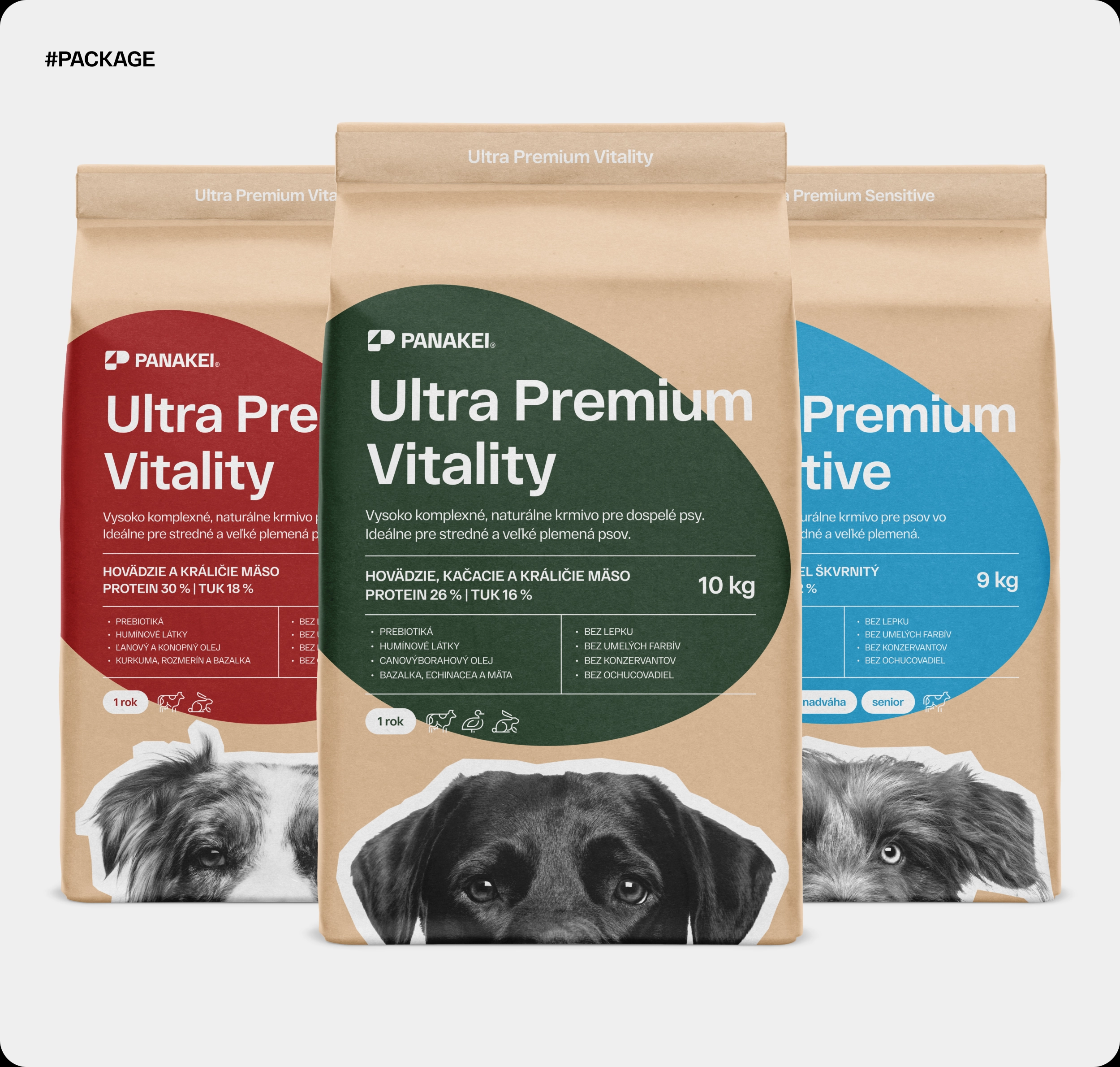




How should premium dog food look so owners trust it right on the shelf? With the Panakei project, we set out to answer that.
For Panakei, a premium dog food brand built on natural, high-quality nutrition, we designed the logo, visual identity and packaging. The Panakei project had a clear goal: create a brand that feels trustworthy, fresh and premium.
The Challenge
Dog owners choose food carefully. They read the ingredients, compare and look for a brand they can trust. Therefore, Panakei had to earn that trust and, at the same time, stand out on a crowded shelf.
Our packaging had to show clearly what is inside while still carrying the brand’s premium character. In addition, the identity had to work wherever the brand meets its customers, from the pack to the website and social media.
The Solution
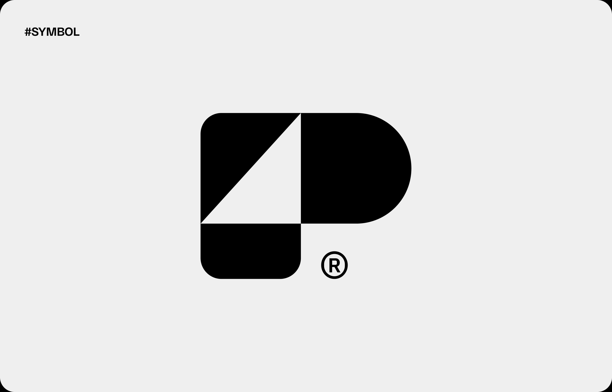
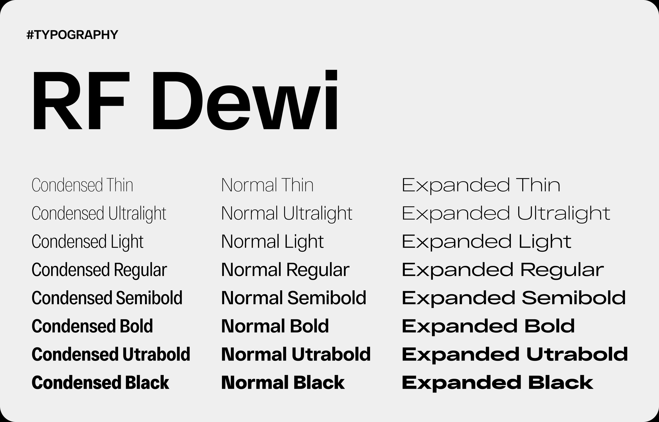
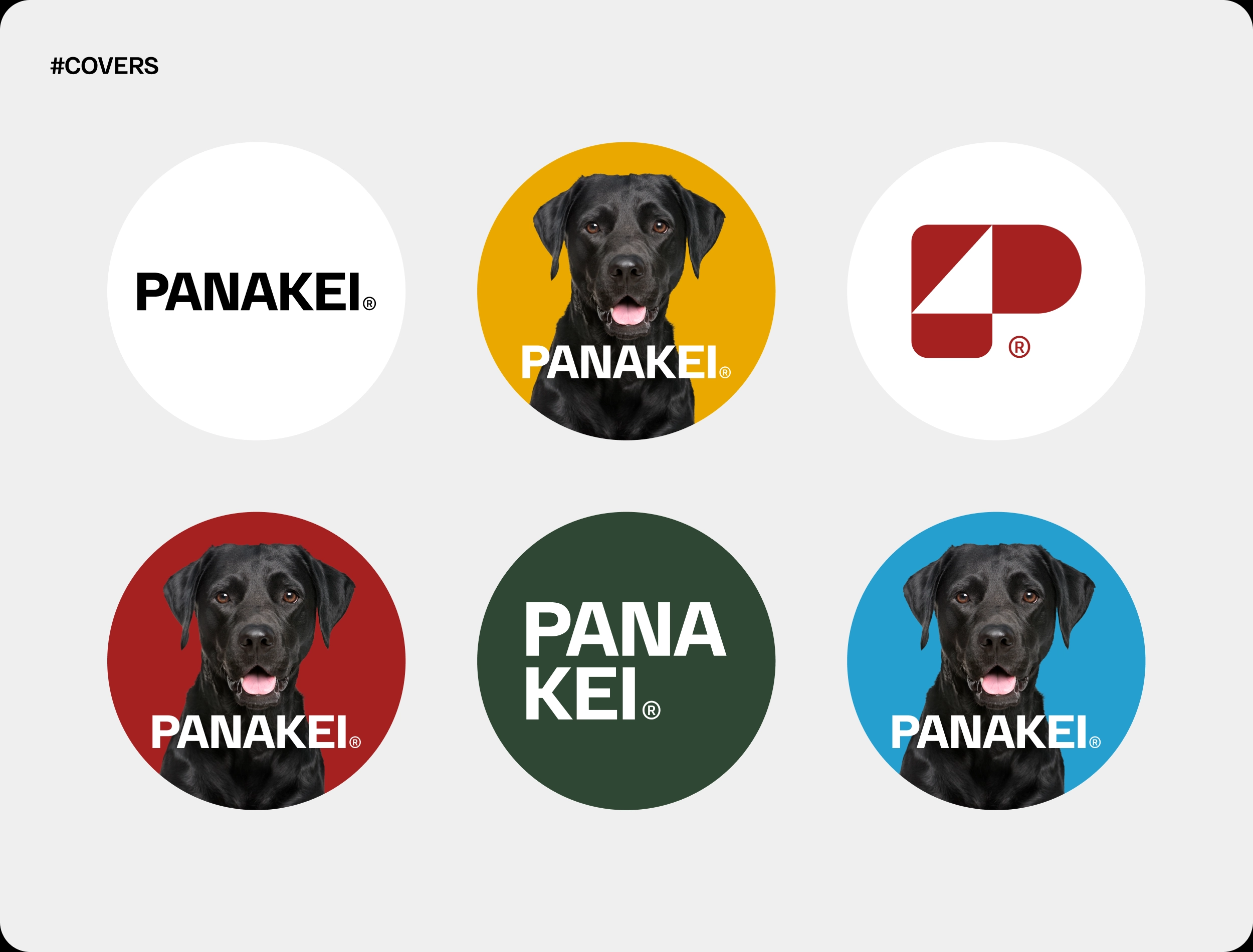
First, we designed a dynamic logo with a standalone symbol that also works as an icon. We paired it with bold typography based on RF Dewi and a colour palette of earthy tones with vibrant accents. These earthy tones reflect the natural ingredients, while the accents give the brand energy.
Then we built a set of animal icons, social media graphics and brand guidelines around the symbol, so the Panakei identity stays consistent as the brand grows.
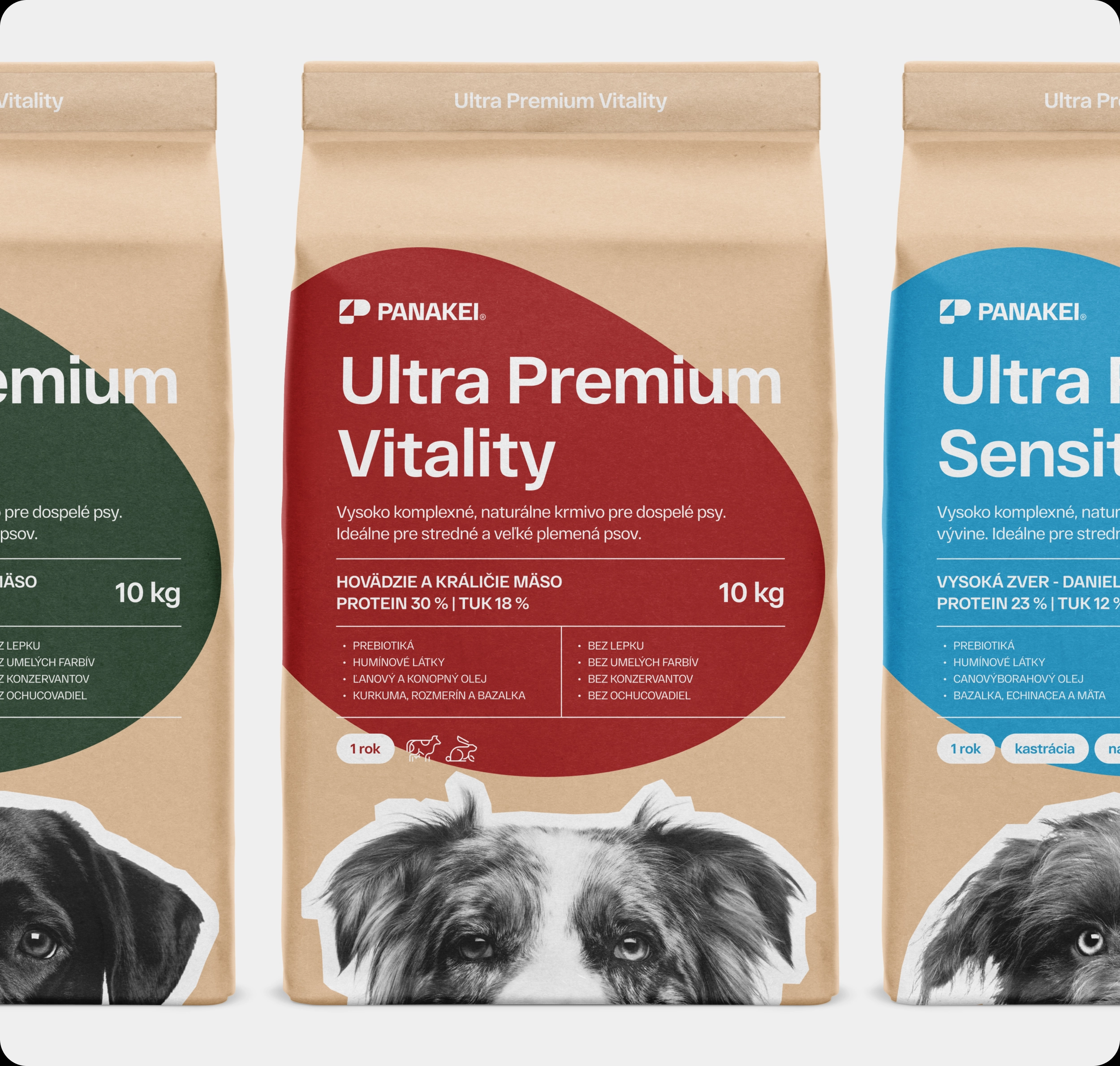
For the packaging, we chose clean, minimalist layouts with clear product information. We extended the system across the whole product range, so every pack feels part of one family on the shelf.
The Panakei Result
Panakei now has a cohesive identity that communicates trust, freshness and care. Its logo, typography, colours and packaging all speak the same language, from the shelf to social media.
Because with dog food, trust decides. And it starts with the first look at the pack.
Check out more of our branding and packaging projects or our services.